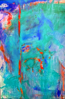
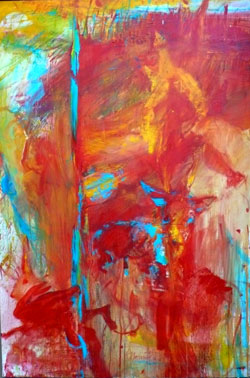
similar starting point, same question as in the article before (green or red?) , other technique (oil on canvas)
similar starting point, same question as in the article before (green or red?) , other technique (oil on canvas)

| diese Details on nomen est omen | |
| Hans Lichtenberger on bleeding indian summer | |
| L on gezeitenauge | |
| Donnie on DIAlog | |
| L on DIAlog | |
| Ing. Hans Starek on A.TUMA : Markenzeichen… | |
| W3000 on nomen est omen |


6 Comments
Oh red – I love the warmth of it and the depth.
– & that´s the “right” one – as I´ve painted it – the other image is changed 180 degrees in colourscale. – & you can´t perceive the hug , the hare & the deer of the right one anymore (exept the turn tail hare in the left corner)…
I like the intensity and vibrancy of the blue one. The red one is much more emotive, if that is the right word. Nice work!
a good term – emotive! I´ve tried to express my own emotion of my inner sight of landscape of the surrounding countryside in winter.
Same time I painted an other piece in blue, unfortunately I sold it without taking a photo – it´s more depicting the landscape in winter vibration. – I´ll try to get a photo & file subsequently!
Red. Definitely. Strives towards the beholder, not away.
ok. – I will stay in tradition – due to the beholder. (caution! – it´s not a definitive statement)
One Trackback/Pingback
[…] owner of the image above sent this photo. according to in article “blue or red?”/comments promised artpiece to compare the differences in coulour & thereby effected impressions I file […]